Some Thoughts On Lettering

A friend was trying to do some comics and having some trouble with getting the lettering to work, so I did a couple quick pages of Things I Think About When Lettering My Stuff.

some-thoughts-on-word-balloons some-thoughts-on-word-balloons-2

I do not claim that any of these tips are The One True Way To Letter. Just that they are things that tend to make my own comics more legible. (I say this because I see a lot of lettering tips about How To Superhero Letters that take a super dogmatic tone.)

There’s a lot of stuff I left out: I did not go into using differently colored balloons, the use of different types of edges for thought balloons or for shouting/electronically transmitted stuff (or for hints about tone of voice), or why I sometimes choose centered text, sometimes left or right justified, and sometimes do paragraphs with indents. I also didn’t go into translucent word balloons – I feel that solid white balloons look super clashy over modern softly-colored art. I also left out the rant about how I feel the ALL CAPS SUPERHERO LETTERING is something best left in the past, where it was a good idea due to the terrible reproduction those things got then. Which also means I left out the digression about the weird little rule that you should never write a superhero comic about someone named Clint Flicker because of how it looks if you type it in all caps and aren’t super careful with the kerning or start having the ink bleed…

Anyway. Hope this helps someone a bit.

How To An Illustrator: Messy Brushes

Screen Shot 2016-03-17 at 1.39.46 PM

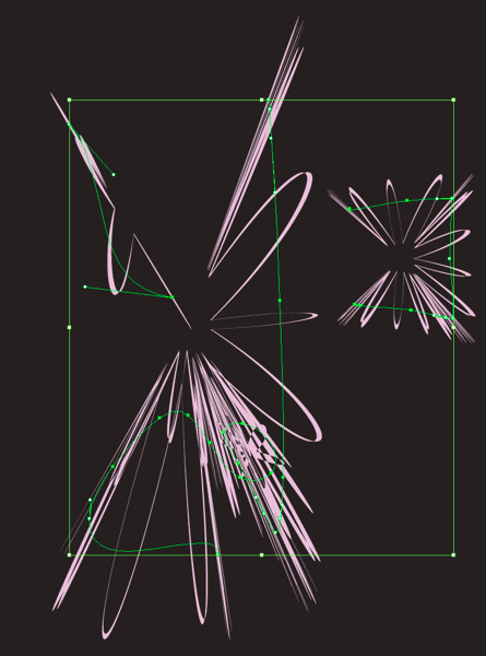
Here’s a thing I’ve been kind of wanting for a while, and finally nailed: that dotty, super-spitty-airbrush look.

  1. Draw a black circle.
  2. effect->brush stroke->spatter, play with the parameters until it looks good
  3. object->expand appearance
  4. object->image trace->make
  5. window->image trace, play with the parameters until it looks good
  6. object->image trace->expand
  7. drag into brush palette, make a scatter brush

All the brushstrokes in that screenshot are done with the same green with varying opacity settings: 50% for all of them, normal/screen/multiply mode.

You probably shouldn’t try to fill in a whole image with this as things would get pretty slow to render; use it to create accents.

You could try different starting shapes and different effects – maybe a triangle that’s been put through the ocean ripple effect is just what you want. Kinda looks like a lot of messy angular brushstrokes, huh?

Screen Shot 2016-03-17 at 1.52.44 PM

Or how about if I add a ‘roughen’ effect to the paths I drew, on top of using the scatter brush?

Screen Shot 2016-03-17 at 1.54.19 PM

Wow, it sure looks like I made a lot of twitchy little brush dabs there, doesn’t it. Thanks for doing the work for me, Illustrator!

stipply brushes

Edit, some time later: Or how about that oh-so-coveted spitty airbrush look? Seriously, I see people asking for that one all the time.

Caveats: You don’t want to try and draw an entire picture with these kinds of brushes. Illustrator will slow way the hell down. Lay in flat shapes with simple filled paths, then come back in and paint highlights/shadows with your Messy Brushes.

Design process: Lexy Franklin

This one’s taken a while. I think I finally nailed it.

This morning, I went through eight years of sketchbooks, looking for drawings of Lexy Franklin, who’s slated to appear in the middle of chapter 2 of Absinthe. Originally she was going to be a white lady, but during development she changed to a black lady, and that’s always kind of a dangerous ground for a white chick to design. Especially as a character who is largely hostile to the main character.

This was the best I had. I knew it wasn’t right.

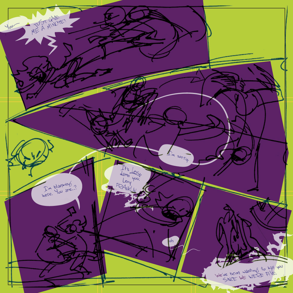
But yesterday I started putting together my loose roughs together with the revised dialogue Nick had written in the time since the breakup. And the new dialogue spawned something interesting:

2-12

Those thorny vines started showing up when she was angry. She’s now prone to very fussy speech patterns; on the previous and next pages she has dialogue like “Damn you, Absinthe! What in perdition are you doing here?” and “It was your sacrilege, Absinthe. Not mine.” (She has a pretty serious beef with Absinthe. She also usually uses the royal We.) And those thorny vines just came out of nowhere, with no real conscious thought – one minute I was drawing the word balloon, the next minute there were these vines coming out of it.

So I had this association with roses. And I thought, what if I carried the rose theme into her? Just a little bit. Not a lot. I showed this to Nick and ran that idea by him, and he loved it.

Evernote Camera Roll 20151103 134307

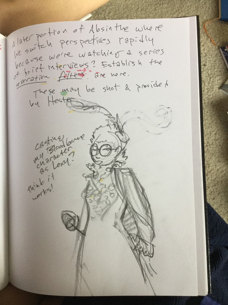
I’d been going around Bloodborne as a tall black lady with magenta hair, glasses, and a propensity for a rapier. That felt like a good idea to inform Lexy a couple months back, and it still felt like one when I found this sketch again this morning.

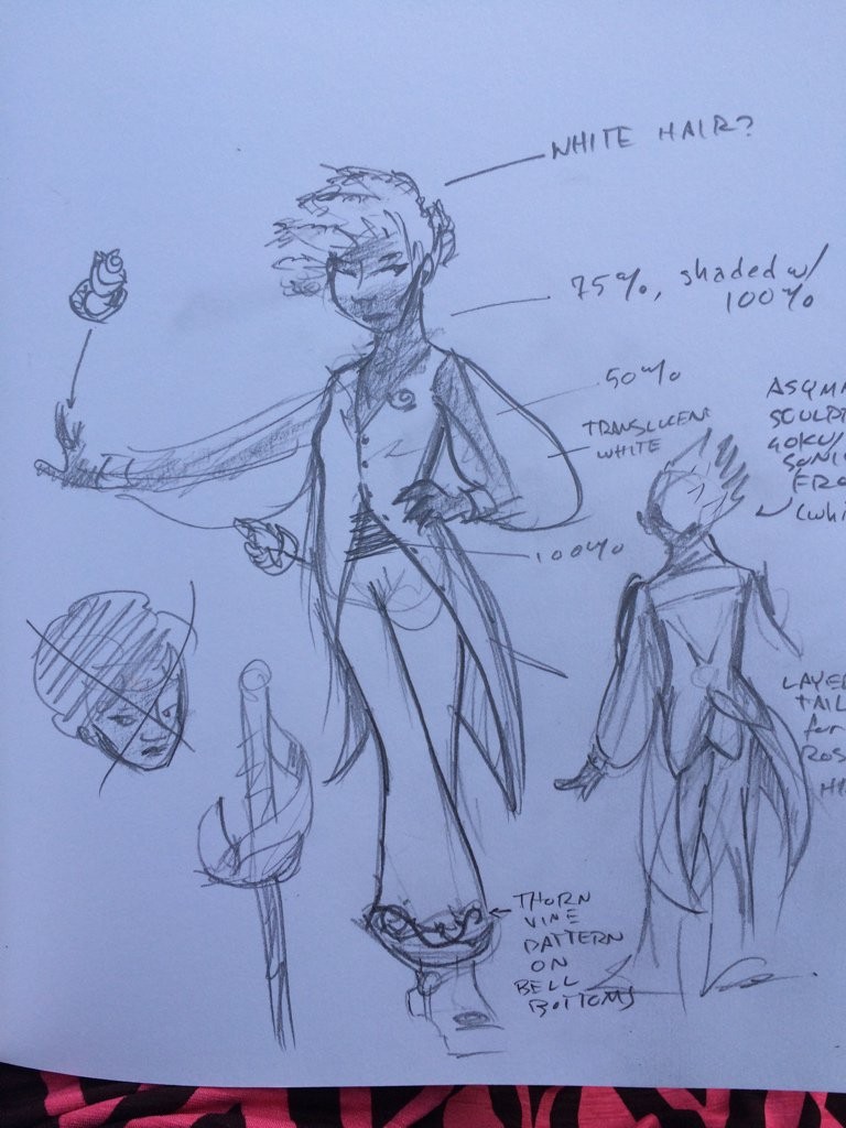
All of this was hanging in my head when I went to lunch today, along with all the various adjectives written on those sketches I knew weren’t quite there. I was thinking: fencing, courtly bearing, rose theme… kinda like Utena, really. But dressed for much hotter climates than the European vibe of that show’s costumes. And a bit more obviously butch. I had a sketchbook with me; I was expecting to start on the first of maybe a half dozen attempts to find her body shape and her dress sense while I waited for my sandwich to get made.

egypturnash_2015-Nov-03

And then this fell out of my pencil. And I was all, “oh, hi, Lexy, there you are.”

(The cut-off text on the right says “asymmetrical sculpted goku/sonic fro (white)” and “layer tails for rose theme hint”.

Lexy

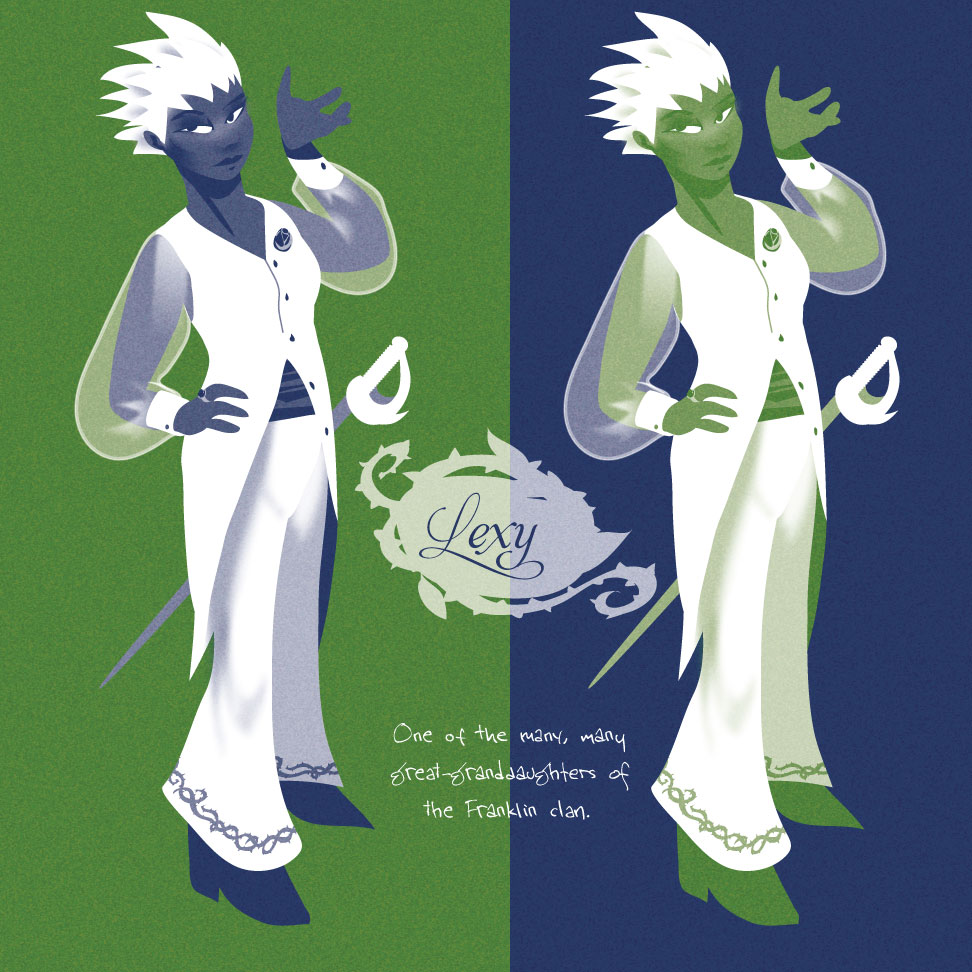
I came home and had a go at her in Illustrator. Yep. Looking good. I still need to find the way to give just the right amount of frizziness to her hair, but that’s a minor detail. Plus a few other things like really nailing down her little rose pin and ring, so I can reuse that important detail in other drawings. Fussy stuff like that.

She is going to give Absinthe so much shit. Don’t worry, Abby deserves it.

rita: omnibus cover iteration

I’ve been playing with cover ideas for the omnibus. (And am still debating skipping book 3, or maybe having it be a stretch goal for the omnibus (wonderful idea, Jer!). If I can bring the omnibus in around $30 for the softcover then it’s a definite go.)

First off is my first image. I really love this one but it’s not really doing a good job of advertising the book; I think it’ll probably be on the hardcover if I do that option and make it to a ‘dust jacket’ stretch goal.

cover-omnibus-h1

But I feel like I really need to communicate the “multiple parallel realities” thing for a cover to work. This just says “it’s about a fast robot lady and has a strong horizontal motion”.

So I pulled in the image I’d done for a t-shirt for the second book’s kickstarter, and simplified it.The arrow would be gloss, of course. Still not there; the figures are tiny and aren’t going to grab you from across the store, or as an icon.

cover-omnibus-h3

Then I tried doing a set of all four timelines, knotted together. Kinda working but I dunno, it just didn’t… didn’t feel right. Didn’t feel like it really had potential. Also felt really potentially fiddly and tedious what with wanting to have the different timelines weave in front and behind each other more.
cover-omnibus-v1

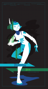
So I pulled out the image I’d done for my convention banner and tried it on a sideways book. Interesting but no. Also kind of annoying and frustrating because Illustrator went unresponsive whenever I tried to copy over the green world layers; I had to copy them one at a time, and had to copy one layer in parts. Pain in the ass.

cover-omnibus-h4

Maybe it’d work on a horizontal book? Eh. It could work but I’d have to draw a new image for this, and I didn’t really feel a single pose could convey the story properly.

cover-omnibus-h5

So I just started doodling. I scribbled a really loose rectangle, then started drawing a bunch of them with the rectangle tool, in the disintegrating/glitched-up look that shows up throughout the story. Referencing an important recurring image, good. Calling back to the very effective (IMHO) covers of book 1/2, also good.
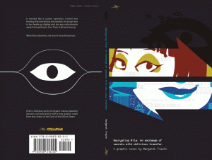
cover-book-1

See? Book 1: bold, striking, conveys ‘confident female lead’ and ‘shattered into multiple realities’. Book 2 has Dragon Rita and Hat Rita looking out of the arrows, worried now as they’re out of alignment. Remix the idea into a wider composition, with a bit more fragmentation, and appearances by all four Ritas, Add in some Panopticon, maybe a couple of cables in the gloss layer, maybe some more source code from the guts of some ciphering algorithm, and I think it’s a winner. Especially once I have white face bits popping out of the color and black.

(Incidentally, this proposed omnibus cover bears little resemblance to the one I have planned for book 3, if that happens. I’ll probably have to draw that anyway, I kinda want to have all the covers in the extra material at the back of the book, along with some notes on my process, the Ask Ritas,  and maybe a little epilogue short for each Rita…)

That show pitch is almost done.

0 Parallax_landscape titles

Parallax-synopsys

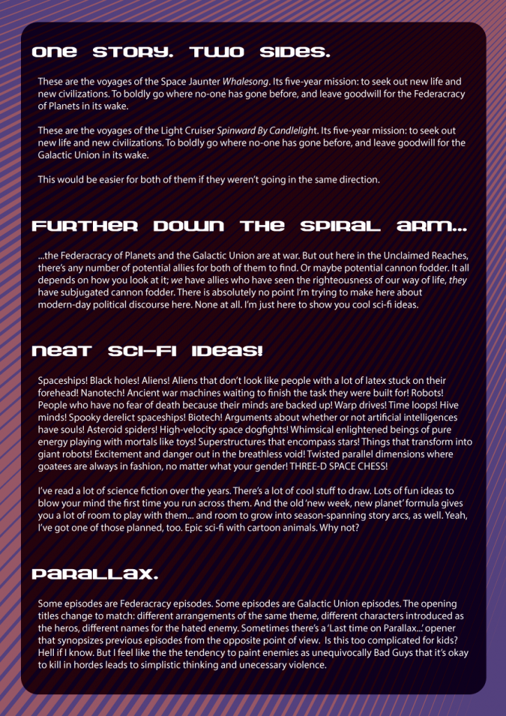
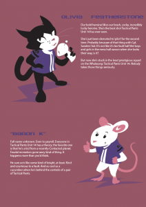
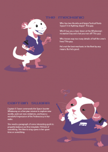
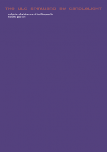
I think this is really starting to shape up nicely. Two characters need fleshing out, the Spinward by Candlelight needs some windows on its lower half, the Whalesong needs a drawing, and maybe I should figure out what the Union fighter ships look like and draw them along with the Federacracy’s Tactical Pants. I’m sort of thinking maybe something that looks like a torso with arms so they can combine with the Pants when some kind of Outside Context Event makes them have to join forces. That might be too obvious, though. I’ll have to doodle around and see if it works. Other suggestions welcome.

Also a handful of episode synopses, including my ideas for the overarching plot that continues across seasons. Then I just print it out and stick it in a couple of presentation folders (one for each side, naturally) and it’s done. And I can get back to Rita.

Big thanks to Nick for suggesting that maybe the Union should be a bit goth, and kind of creepy-cute.

it has a new name now and everything

ensign k remix for nickelodeon_landscape titles

I think I like how this cartoon pitch is shaping up. I shouldn’t have any problems filling out the rest of the blank spaces in time to pitch it to Nickelodeon at SPX. And to Cartoon Network while I’m at it.

Needs a page with a loose map of the galaxy this takes place in, and something about what I’m trying to do with this show. I’ve probably already written a decent explanation of how it should be fun space adventure, with an undercurrent of your enemy is never a villain in their own mind, so stop caricaturing them already. Also a note that ideally this would all be 3D, with super-designey flat color rendering. But probably a wider palette than I’m using here.

Impending endings.

I woke up this morning thinking about chapter 25 of Rita.

This happens every now and then. It's an important chapter, with a story event that I've been planning since the very first thoughts of “wouldn't it be cool to do parallel storylines on the same page”.

Thing is? This time, it's the next chapter to rough out. I have been looking ahead to this chapter for four years; it's been the distant light in the darkness that I've been navigating by for all that time. It's gained more details as I've gotten closer, but it's still felt like it's been a million miles away for all that time. Now, suddenly, it's right there in front of me.

It's kind of scary. Have I laid adequate groundwork for it to make sense? Will I be able to pull off the complicated drawing necessary for it to look anything like how I've envisioned it these past four years? I don't know. I have some ideas for how to do this bubbling up from the back of my brain; I'm confident that one of them will work well enough. I may get off the rails of my two pages a week schedule again; I may not. If I keep it on schedule that's awesome, but I'd rather take the time this chapter needs – it took me four years to get here, I don't think a week or three either way is going to matter. I'm going to finish this thing properly.


And then I get to hold off celebrating. Because the book won't be done quite yet. There will be about twenty pages after that climactic moment that have to try and bring the story to a satisfying conclusion, despite the pointed absence of one important event.

Anyway. Guess I should have some breakfast and get to work.

It too easy is.

Recently, there was a thread on a webcomics board I participate in: Post your old art and your recent work, to show how far you’ve come. I dug up some old B&W stuff from 2000; one regular on the forum commented that he really liked it and asked if I’ve ever thought of playing around with that medium again.

I replied that “…mostly I kinda feel like relying on outlines is just too damn easy; after all the time I’ve spent wrapping my head around ways to create a well-defined image with only a handful of colors it feels like cheating.”

And I kept on thinking of this moment from The Planiverse. It’s a book about a 2D world with 2D physics somewhat modelled on our own; at one point the main character encounters a Great Artist, and they discuss his work. At the time, Dar Jisbo is working on highly abstract art, and despairs of ever making a piece that doesn’t look like anything at all – it’s really hard to do this when you’re working for a 1-dimensional retina.

Na did her very best to shake Dar Jisbo from his despondent mood, ending by suggesting that he paint Yendred’s portrait.

[Dar Jisbo said] “You, dear one, closer are and far more beautiful. Allow me what little of my conventional skill remains to demonstrate.”

Taking a small pad of paper, Dar Jisbo studied his subject carefully and then, beginning at the top of the paper, skipped his pen lightly and confidently along its surface from top to bottom. The whole operation took about ten seconds. At the end, he detached the paper and handed it to Na, who cocked her head to examine it. Yendred leaned eagerly over her, the better to view the portrait.

“It perfect is! What skill! Why you more pictures like this do not create?”
“It too easy is.”

(Yes, all of the dialogue Yoda-mode in is. It’s somewhere between annoying and charmingly alienating. Yendred is the main character; Na is showing him around where he meets Dar Jisbo, and Dar Jisbo is the artist.)

I suspect this is probably an adaptation of a koan; it has the shape of one. Whatever its source, though, this is the version that stays with me, and bubbles up every time I think about what it’s like to be an artist.

“These drawings of yours with conventional lines are wonderful! Why don’t you do more like them?”
“It too easy is.”


reference selfie

AnimatedPhoto
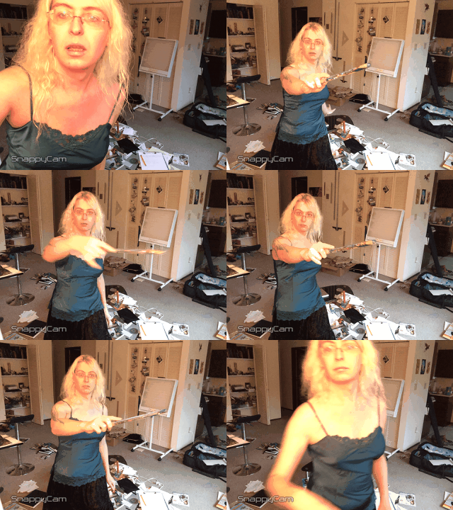
Animgif compilation of reference shots for #witchsonaweek.

Tools: iPhone, GorillaPod for iPhone, and the no-longer-available-on-the-app-store SnappyCam. Clamp it to a lamp, dial its speed down, and go.

(Apple hired the dude who wrote SnappyCam, which is mostly about taking super high-res burst mode shots – he did some serious magic in his compression code to save a lot more data than normal. It just so happens that he also lets you dial the speed down as far as 1 photo/hr. 2/sec is GREAT for taking a rapid flurry of reference selfies.)

I highly recommend the combination of your phone, the phone Gorillapod, and an app that can do auto-selfies for when you need some quick ref. It won’t help much if your body is strikingly different from what you’re drawing, but it’s quick and easy. Especially when you can use the front-facing camera and actually see your shots as they happen.

Before I got Snappycam, I used either Genius or Camera+; one of those two offers both timed self-shots and repeating timer, but annoyingly won’t go any faster than 5s/shot, so it’s kinda tedious. Now that I have Snappycam, I didn’t bother with either of those two when I chose my new app loadout after losing my old phone.

(PS: The wand is clear plastic, with a bunch of glittery stars and beads suspended in some kind of liquid inside of it. It is also the wand I use when I do serious magjickq’n stuff. Hand-turned ash with crystals embedded in it? Bah. I’m a chaos witch, and using something like that would mean I was starting to take this stuff entirely too seriously.)

the process: a cute AI globby brush

Here’s a fun little brush I just whipped up in Illustrator.

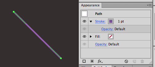
1. Draw a 1-pt line.
Screen Shot 2013 10 11 at 4 32 50PM
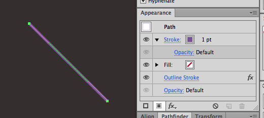
2. Go to the appearance palette, click on the ‘fx’ dropdown. Path->outline stroke.
Screen Shot 2013 10 11 at 4 33 04PM
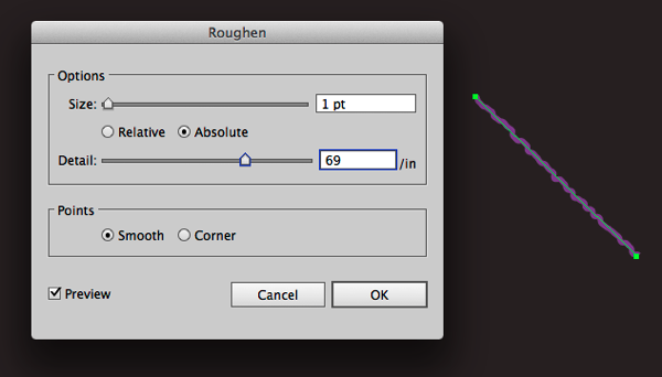
3. fx->distort & transform-> roughen.
Screen Shot 2013 10 11 at 4 33 29PM
These are the settings I used, go with whatever makes you happy.
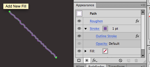
4. Drag the ‘outline stroke’ entry in the appearance palette ONTO the ‘stroke’ entry.
Screen Shot 2013 10 11 at 4 34 06PM
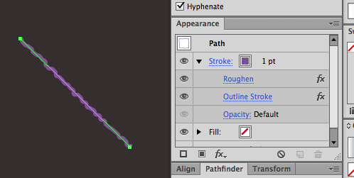
5. Drag the ‘roughen’ entry to just above the ‘outline stroke’ entry.Screen Shot 2013 10 11 at 4 34 14PM
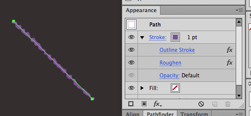
6. Drag ‘outline stroke’ ABOVE ‘roughen’.
Screen Shot 2013 10 11 at 4 34 21PM
I tried other ways to make this stack of effects happen, but this is the only one that would reliably and repeatedly work for me – I’m pretty sure this is some kind of bug.
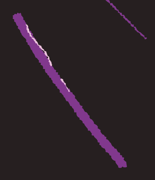
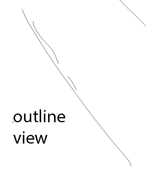
7. Now you have a cool brush with messy edges! This is a 6-point dark purple stroke, with two 1-point strokes slashed in over it in a lighter color.
Screen Shot 2013 10 11 at 4 34 45PM
Screen Shot 2013 10 11 at 4 44 25PM

I may never draw a squiggly highlight by hand again. I’m making a graphic style of this and sticking it in all my startup documents.

BONUS ROUND: PRESSURE SENSITIVITY!
Screen Shot 2013 10 11 at 4 45 24PM
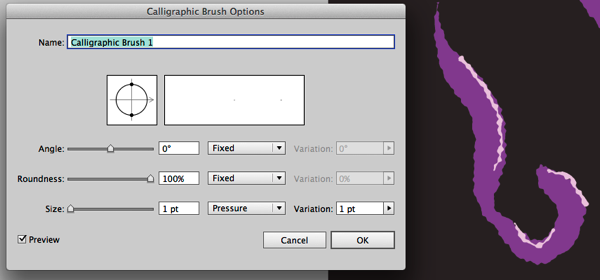
Make a simple calligraphic brush. Now you can use the brush tool (B), vary the width of your squiggly lines with pen pressure, and choose different “sizes” of brushes with the stroke width panel.

You could probably do a bunch of other interesting things with this method of outlining a pressure-sensitive stroke, then applying live effects to it.
Screen Shot 2013 10 11 at 4 52 07PM
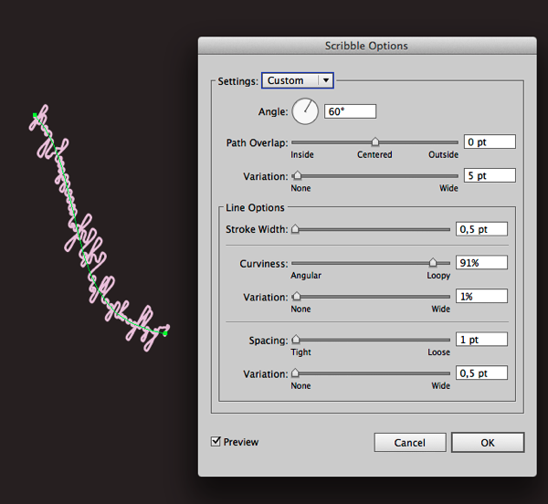
Stylize->Scribble looks pretty cool, for instance.
Or how about stylize->distort and transform->pucker and bloat?
Screen Shot 2013 10 11 at 4 56 14PM

Fool around, stack some effects up, experiment. If you were really dedicated you might be able to produce a really fun set of janked-up styles.