The Birthgrave

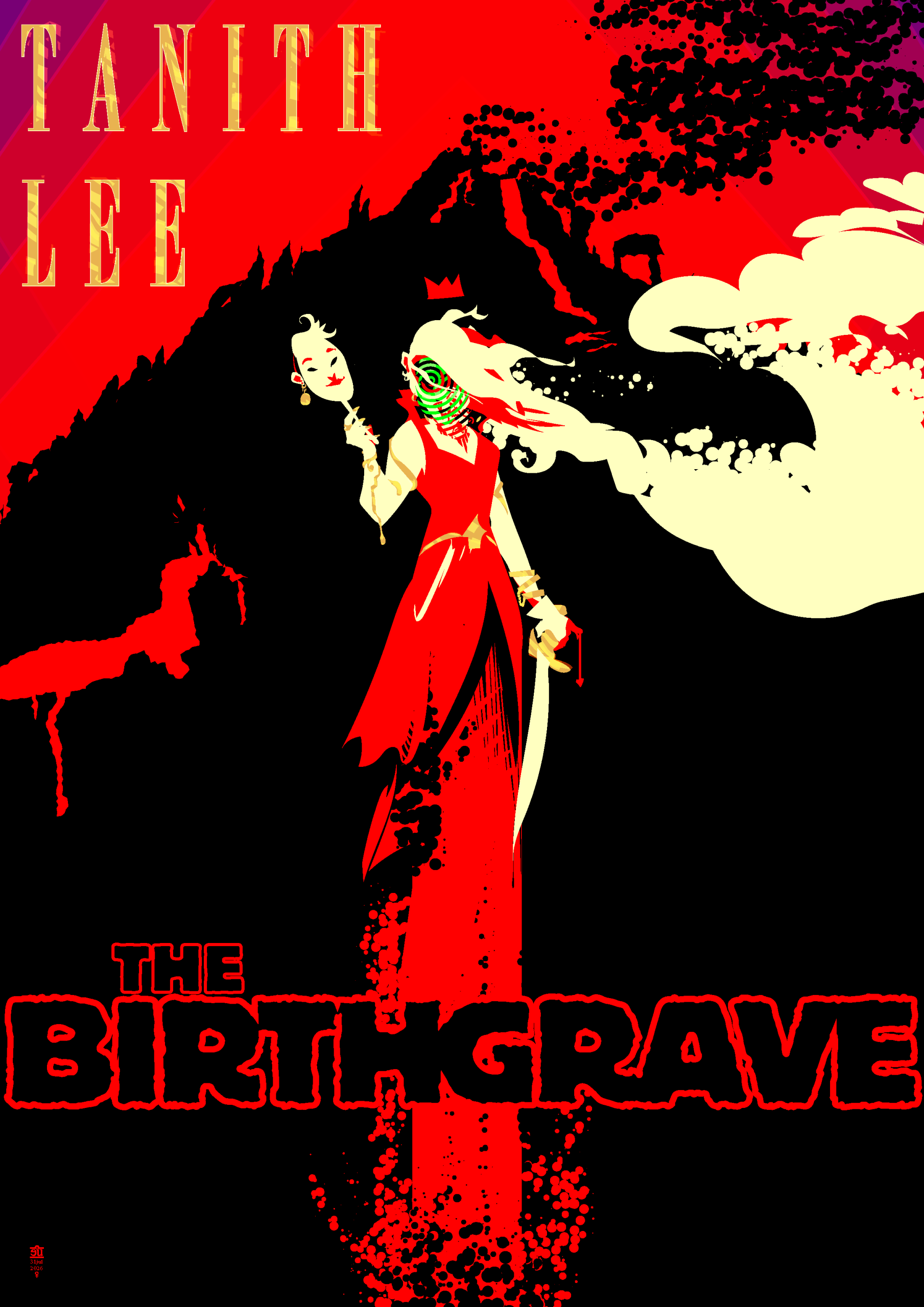
A couple days ago I started reading Tanith Lee’s first published book, “The Birthgrave”. It is a pretty wild ride. A nameless narrator wakes up under a volcano that erupts shortly after she leaves; she wanders through a medieval world, trailing chaos and destruction in her wake, with dream-like detachment from all the strangeness and horror around her. A few chapters in this image presented itself in my mind and would not go away until I got up and drew it; as I read the book I kept on occasionally returning to this and refining it.
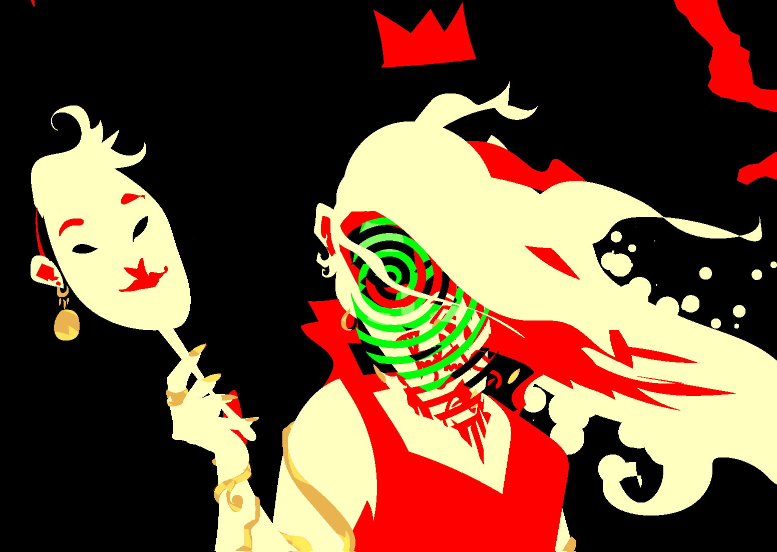
There’s a lot of ambiguity about the protagonist’s face through the whole book. She describes herself as hideously ugly but never goes into detail. She’s constantly wearing masks to hide her face, hence the one in her hand here.


I went through a lot of iterations on the type, and all of these iterations got preserved in hidden layers in the file, so here they are. I generally went with really big and bold type because most book covers are rarely seen larger than a little thumbnail image in an e-book app’s library any more.
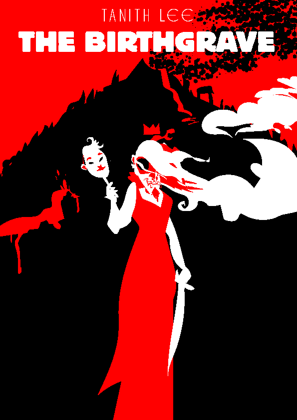
This was pretty much my initial sketch.
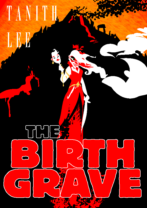
 

This is where the figure and bg were for a lot of the time I worked on this, the sky went from flat red to red/orange/yellow, then finally to red/purple near the end. The green spiral face stuff was one of the last touches too; both of these final choices are informed by events near the end of the book.

I really liked how big and bold this type was but hated how it lost the way the title is clearly two words crammed together into one. BIRTHGRAVE hits harder than BIRTH-GRAVE or BIRTH GRAVE, it just feels a lot more WTF-inducing.

I tried a few different fonts and this one was kind of working but it drew way too much attention to itself and felt too much like a comic book. Also I did not like the way its counters were filled in, and did not like the way it looked enough to chop and screw a more normal font into something similar.
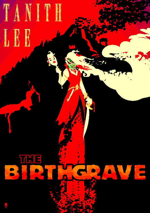
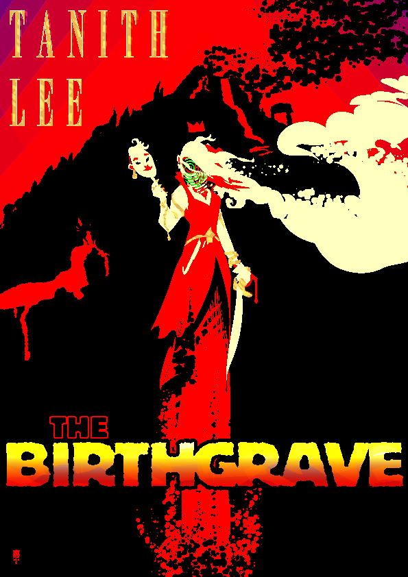
I kept on trying to see if there was a way I could make colorful type work but it drew too much attention away from the figure; ultimately I decided less is more.
Here’s the final version again, shittily scaled down by WordPress. Works pretty good. The face changes depending on the scaling and I very much like that.
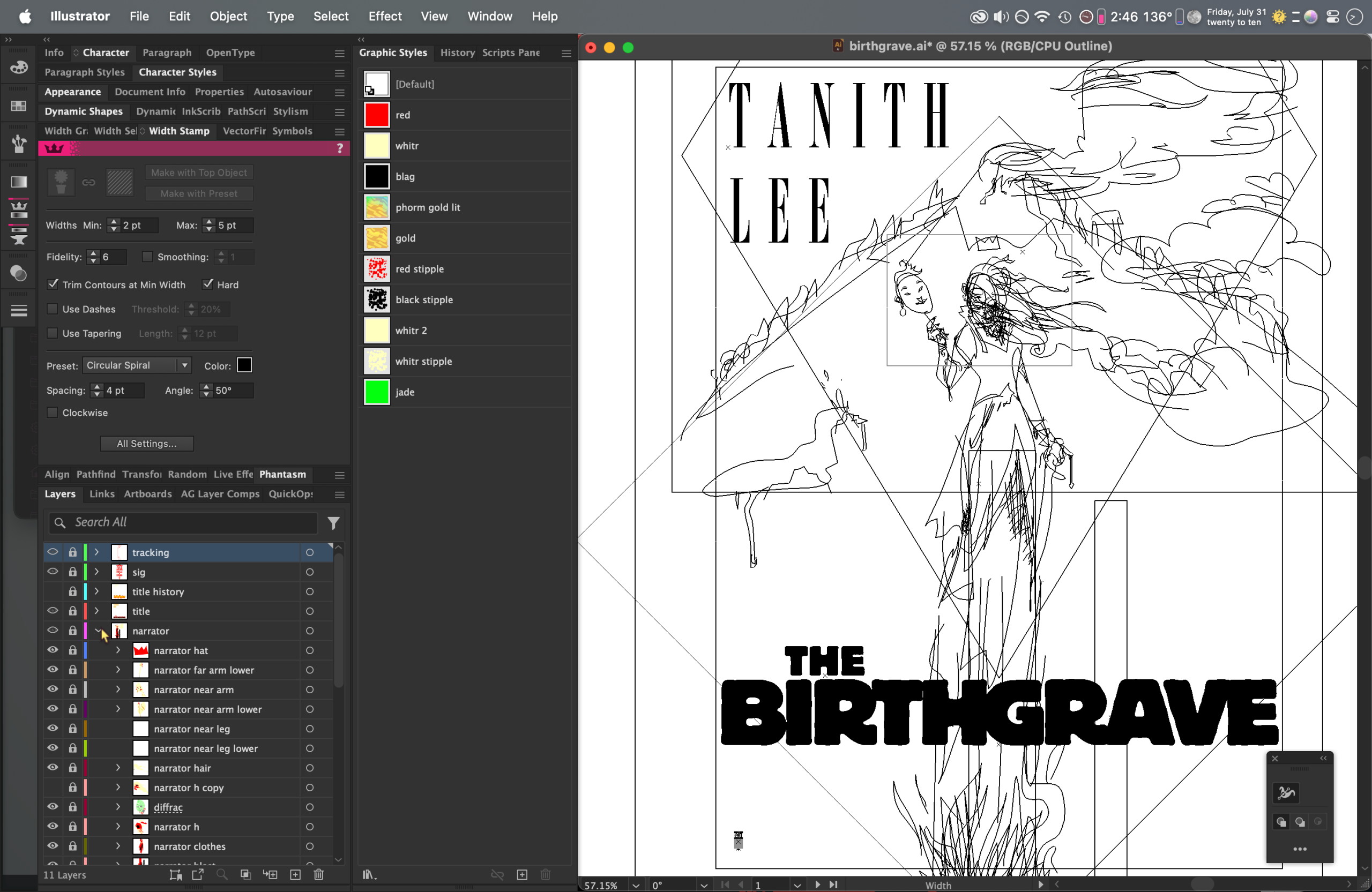
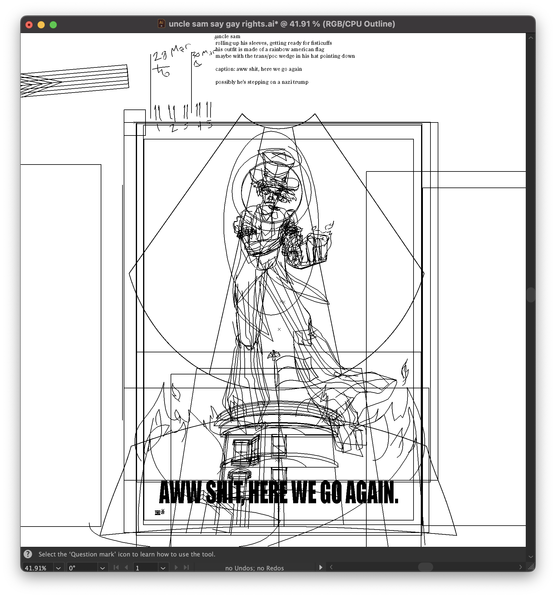
Outline view. 100% human-drawn shapes in Illustrator, no AI involved.
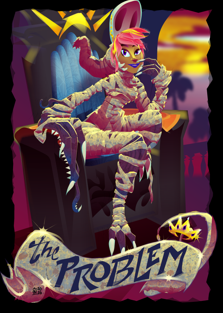
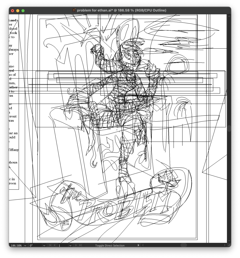
The Problem

Trading card for Ethan’s new book. The Problem has a family curse involving a giant angry mass of meat and teeth. Illustrator, 2.5h.


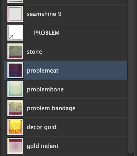
I think it is very important that you know there is a graphic style in this named “problemeat”.


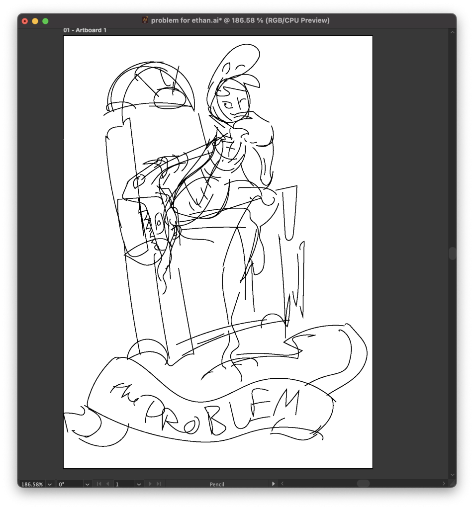
Here’s the hilariously crappy sketch I started with. Sometimes my roughs are better. Sometimes they’re not. Attitude and composition are what matter when I already know what the character looks likr, not precise anatomy.
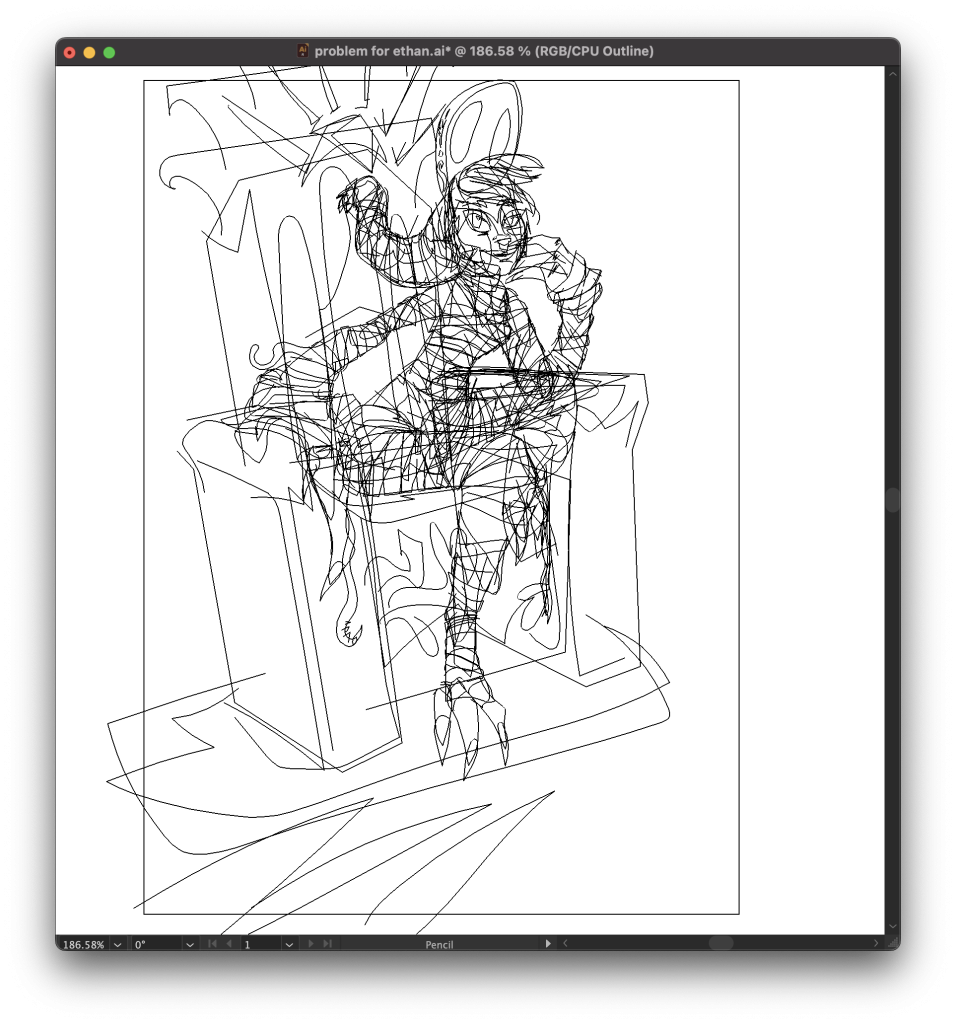
And here’s the outlines with the bg/banner turned off. As usual most of the shading happens automatically via the very complex graphic styles:

I just draw shapes and Illustrator fills them in with texture and half-assed shading instantly. Then I add broader shadows over them and maybe tweak the shapes and/or the styles, until I think it’s done.

The Parting Of The Veil

Once a year, on Trans Day Of Visibility, cis people get a brief, furtive glimpse of the glories that lie outside of the gender binary. For them, it’s just a flicker. A vision that fades quickly. For us, it’s every minute of every day, if we want it to be. Sometimes we don’t. Sometimes you just wanna lounge around the house and pet the cat, y’know? Nevertheless.

Click on this thumbnail to see the truth.

This one took lots longer than it should have; creating an intertwine group while drawing the jewelry caused Illustrator to start crashing when I’d attempt to save, and I spent like two hours fighting against this until I finally decided to track down what the problem was. Guess I’m putting a big asterisk next to that feature in my head, it’s nice when it works but it sure can make some trouble when I use it with my insanely complicated appearance stacks.

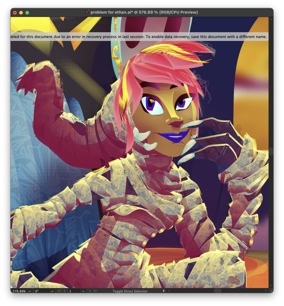
I see the error banner on that screenshot of the outline view all the time in Illustrator. I suspect it happens because Illustrator decides that my massive files take too long to save a crash recovery snapshot of, so it decides I don’t need crash recovery for this file. Very helpful. Especially for a program that’s as unstable as Illustrator’s been getting the past few years. Luckily I learnt to save defensively long before the crash recovery feature existed. Astute’s “Autosaviour” plugin helps a lot by reminding me to save every ten minutes. I used to have it set to do that every half an hour but as time goes on I keep on turning that time down more and more.

Every Hundred Years Or So


This Saturday, I went to the No Kings rally here in New Orleans. Kermit Ruffins got up on the stage with a trumpet and started playing The Star-Spangled Banner. Slowly, the crowd started singing along. I joined in too.

And above it all, for a brief moment maybe I saw Columbia, but that was soon replaced by a vision of Uncle Sam, huge above the crowd, rolling up his sleeves and getting ready to fight. I’m too fucking old for this, but here we go again was the feeling I got, along with a distinct weariness, and an overwhelming sadness. Tears welled up in my eyes, and they’ve come back whenever I’ve talked about this.

Me and the spouse left not too long afterwards, we didn’t stick around for the march. But this image kept on hanging there in my head, and later that evening I opened up the computer and started working on this. I spent about three hours without a break on the figure, which is a little unusual – usually I take breaks every half hour, but this was burning in my head and needed out, I guess. Another couple hours today and it’s done.

Also, before you count, there are 50 stars on the Starstika And Bars flag, 13 red rays in the sky, and if Sam wasn’t in the way there would be 50 stars and 13 rays in the halo around his head.

Illustrator, 5h.

If you want to print this out for protest sign purposes then please feel free. If you want a higher-res copy for sticking up on walls or something them contact me. :)

Here’s a link to a 300dpi A1 copy (~2×3 feet, ~8 megabyte JPG) and should probably work for a lot of signs and posters. Send me a photo of it in action!

I’m Sure They’ll Listen To Reason

GAY WRATH MONTH STARTS EARLY THIS YEAR, MOTHERFUCKERS.


I was gonna work on some commissions or the comic today, I just submitted the comic for the Ignatzes and I really should get the last 3 pages of the current chapter drawn before judges start reading it, but instead I ended up sitting around at Envie doodling a Pride selfie kind of thing. Go figure. I was doing some low-key magic to try and convince the universe I’m gonna have a gallery showing of some stuff like this and sell real well and maybe that was part of why I felt compelled to do this? Who knows.

For the past few months, when I go to draw my fursona, I’ve been getting a humantaur instead. Four legs, four arms, often four boobs too. I don’t know what this means but I’m enjoying it even if posing all those body parts gets complicated, when this started she was sitting down on her rear haunches but once I said “hey what if I’m holding a giant fucking sword” it kinda had to become more dynamic. I think this is the first image I’ve posted here but I’ve got a few more in the pipe.

I wanted this as a big print on my wall so it’s up on Redbubble. If you want one, or a shirt or a shower curtain or something, then visit that link.

Illustrator, 3.5h.

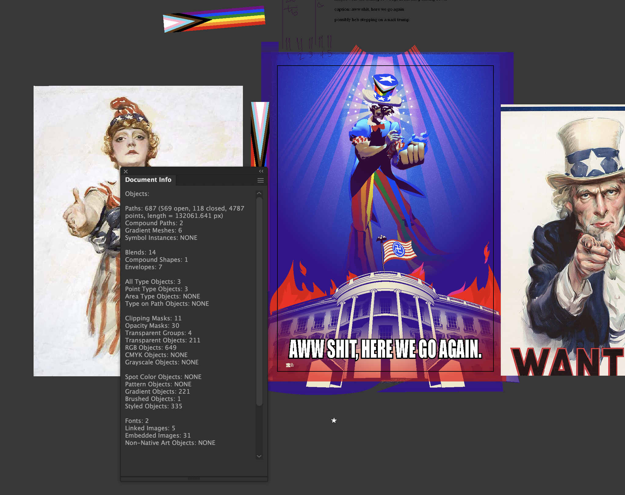
Here’s a screenshot of an earlier version that I made so I could put it on Instagram without it murdering the aspect ratio, this one had a lot of “oh it’s done and I can post it, wait no it needs something else” moments.

All those opacity masks and embedded images are generated by Astute’s Opacity Brush plugin, which makes that *super* easy to do.

In The Temple of Loss

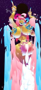
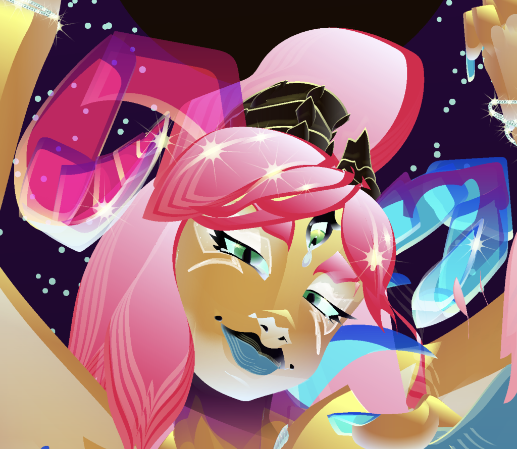
Big epic fantasy commission for Cordite. This one took a while and I stopped being able to tell if it was any good by the time it was done.I worked on this in fits and starts over about three months.

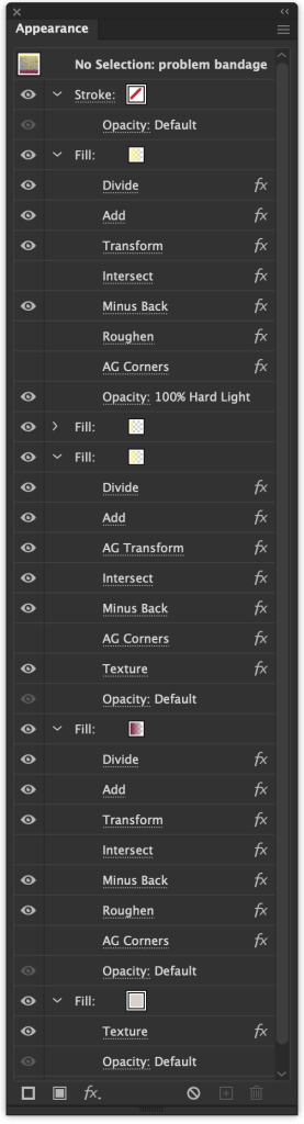
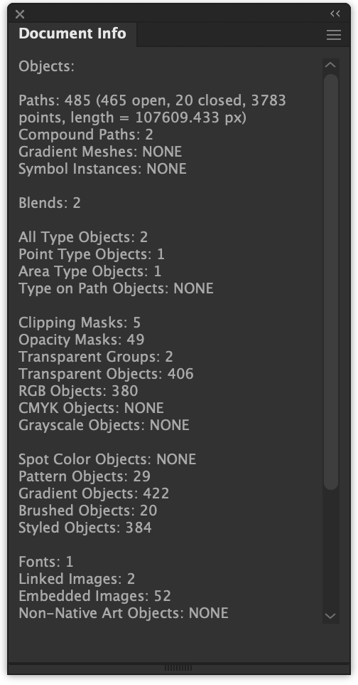
There’s a lot going on here. Enough that Illustrator crashes when I try to find out how many paths are in this file.

Very early rough, with crude colors to help the client make some sense of my messy lines, and to begin to think about the overall color scheme.

Priorities

At the beginning of the month, this popped into my head. I did a quick doodle and posted it, asking if I should finish it; the responses were unanimously “yes”.

Illustrator, 4.5h, about one of which was making those buttons by tracing sigils from Denning & Phillips’ Planetary Magick, which I’ve been working with lately. Making a serious go at its rites has definitely caused some interesting sensations.

Patrons can get the Illustrator source here. And if you want prints, t-shirts. stickers, etc, they’re on Redbubble.

Interactive Propaganda

I looked at this and said “this needs clouds behind her” and then it started to feel like the character select screen of a video game so I spent a while turning it into that.

The multicolored type would probably be color cycling if this was an actual video game, and of course it would be scrolling up into the sky and giving you the usual attract mode stuff – enemy point values, copyright info, maybe even a couple more sentences of story, stuff like that. There is a token straight cis character but the text probably still reads “trans witch powers”, you just get to borrow them after saving a trans witch or something. It’s an indy game, we don’t have the budget for changing that! We most assuredly do have the budget to make sure all the text gets everyone’s pronouns right (because of course there’s a transmasc warlock or two, and maybe an enby).

brb, gonna go learn 3d and godot or unreal or something


vector witch

She’s pretty nice as long as you don’t make fun of her really, really strong text-to-speech accent.

13min doodle in Illustrator, after having fun playing Grid Ranger for a while.


Astute’s plugins are doing a lot of work here. Every single effect you can see is that appearance stack is one o theirs. The filled-in eyes have an extra fill on top with Illustrator’s native Scribble effect applied, so there’s some native effects going on here.

Sator Square

This is a 100% black and white image. Any changes in brightness and color are due entirely to glitches in your visual processing system.


Illustrator, about ten minutes.