Over on the Illustrator subreddit, someone posted a link to this image, asking “is it possible to make something like this in Illustrator”:
And it got the usual “not really, use photoshop/uh I guess you could use gradient meshes but use photoshop/you could but it’d take years, use photoshop” answers from people whose knowledge of Illustrator kinda stops at the pen tool.
Me? I looked at it and was like, yeah, pretty easily. Lots of organic pencil tool shapes, do some blurred shapes for the smooth hills, stack up some transparency in one of the ‘light’ blend modes for the tonal shift in the sky, make some art brushes for most of the tree you’re good. I tossed off a quick reply to that effect and went to bed.
I woke up to a reply saying “I call bullshit”.
And I was like, oh, kid, it’s on now.
So I got out of bed and got to work. Forty minutes later, I had this.
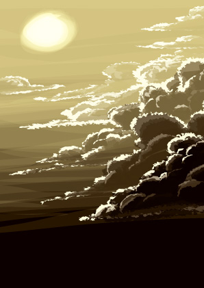
Which obviously is not as intricately done as the original image, and doesn’t have the knowledge of How To Clouds that the original artist seems to have been building for about a decade or so (seriously this guy can clouds wicked good, like half his gallery is is full of meticulously-rendered cloudscapes). But I was like, yeah, if I was willing to spend a whole day drawing clouds at about 4x the size of the jpeg under discussion, I could get a sky like that image. “Doing the rolling hills and mountain is left as an exercise for the reader.”
I replied with my quickie rough and those caveats, and got a ‘holy shit!’-toned reply back. Yeah, I’m just that good. *preen*

And then I spent about fifty minutes on a picture of myself blowing a cloud off my stylus like a gunslinger after a trick shot, with some of my own usual tricks for clouds added to the mix – various amounts of gaussian blur, a bit more roughen/tweak effect here and there, and of course a mezzotinted overlay for texture. I’m still not as good at clouds as Mr. Smith is and probably never will be, given that his handle is “Ascending Storm”, but I’m pretty happy with how this one came out.
If you want to see how it’s done, a CS6 source file is here: clounds-cs6.ai (I use CC2016; CS6 is the oldest version it’d save it as without crunching the blurs into an uneditable bitmap.) Or you can read about the tricks I used to draw this in a fraction of the time you think it took if all you know is the pen tool.

The basic appearance of the cloud shapes is this:
Roughen in this case was set to 4pt, absolute size, 15/in, and tweak was set to 3% horizontal and vertical, only modify in/out control points. This results in a simple ovoid squiggle becoming something kinds complicated and cloudy:

Draw a big white bubbly cartoon cloud, add this effect, and suddenly you’ve got all these fiddly vaporous bits. Change the fill color to black and start drawing some shapes at 50-70% opacity, maybe switch back to white and a high opacity and add in a few inner highlights, and pretty soon you’ll have some nice stormclouds with very little work. (Protip: go into the ‘tools’ section of Illustrator’s keyboard shortcuts and assign the number keys to 10-100% opacity, then you can switch opacity on the fly.)
You can further complicate this; Smith’s work has fairly discrete colors and really solid, heavy clouds, but I prefer more vaporous clouds on sunnier days. So for the self-portrait clouds I added a little bit of gaussian blur. Not much, just like 2-5 pixels worth on different shapes as I went out towards the left edge of the cloud. (Process: select a handful of shapes, press the hotkey I’ve made for gaussian blur, frob the slider, hit okay. Select more shapes further down, repeat.)

That still looked a little chunky, so I targeted the layer and added a bit more roughening, tweaking, and blurring to the entire cloud at once:

You can target a layer for effects by clicking the circle on its right in the layers palette; the dark circle on the ‘clound‘ layer indicates that there’s an effect applied. These are some pretty subtle effects – roughen is 1pt absolute, 47/in; tweak is 2pt, modifying anchor points and ‘out’ control points; the gaussian blur is 1.7 px. All of these numbers are ones I arrived at by the time-honored method of yanking the slider to a random point that felt about right and tweaking it until it looked good; I’ve been using these effects long enough that I have a general sense of how it’s gonna look.
You can, of course, compact more of the shapes in the cloud into one path. I did a lot of the shading on the figure with this appearance stack:

Two quick paths become like six super-ragged, fiddly, translucent shapes, for some nice smooth and textured shading done in seconds. There’s a few interesting tricks going on with this appearance stack, so I’ll dissect it a bit more.
The ‘add’ at the top seems to do nothing if it’s the only effect on a path. Go on, try it – draw a quick shape with the pencil tool, give it a fill color, and add the ‘add’ effect. Nothing seems to change. But if you switch to a stoked path, you’ll see the difference: the ‘add’ effect forces Illustrator to close your sloppily-drawn open path for you This is important down below in the top two fills, because it completely changes how ‘offset path’ functions…

See? Turn it off, and the two fills with an ‘offset path’ effect turn into what looks like a simple, boring stroke. (I’ve also turned off the roughens and tweaks to show this better.)

I mean, it’s not like there isn’t a cool watercolor edge effect kind of thing going on here, but it’s just not much good for multiplying your effort by drawing one path and having Illustrator lay down two or three more similar-but-different ones, right? But doing the ‘add’ effect (it’s under the Pathfinder effects, btw) closes the path, and suddenly ‘offset path’ starts outputting a slightly larger or smaller copy of the whole shape.
Each added fill is offset a different amount from the base shape; they’re also tweaked up at a large scale (5pt, out control points only), then roughened (4pt absolute, 15/in), then tweaked again (3%, in/out control points) to jank them up nicely.
As to the figure? Since I was being quick and lazy, I googled ‘blow smoke from gun’ to get a general idea of the pose, dropped the first one with a good silhouette into Illustrator (the second one on the results page), and quickly sketched the outlines of the major shapes with the pencil tool.

I then deleted the image, drew solid shapes that looked like what I see in the mirror, drew some loose shading with that cloud appearance, and added some more shading with the appearance stack outlined above. Mix in a photo of my Wacom stylus to get its proportions dead on, and a few minutes looking at how I hold it when I lift it up nearly vertically, and I was pretty much done.
(That probably sounds pretty cavalier; honestly after drawing for twenty years it really is that simple to me. As always, the big major tips for this are “learn to draw for real”, and “double-click the pencil tool, turn on ‘fill new paths’ and ‘edit selected’ and turn off ‘keep selected’, then you can very rapidly swish out solid shapes with your Wacom tablet and throw your RSI-inducing mouse in the trash where it belongs.)
And for the finishing touch, I added one of my trademark cheats to make an image look a lot more detailed than it really is: make a new layer, draw a big rectangle that covers the whole image, add the mezzotint effect, then target the layer and set it to about 12-25% hard or soft light. I do the transparency on the layer rather than the mezzotinted rectangle because that way Illustrator doesn’t try to re-render the mezzotint effect every time I tweak the transparency.