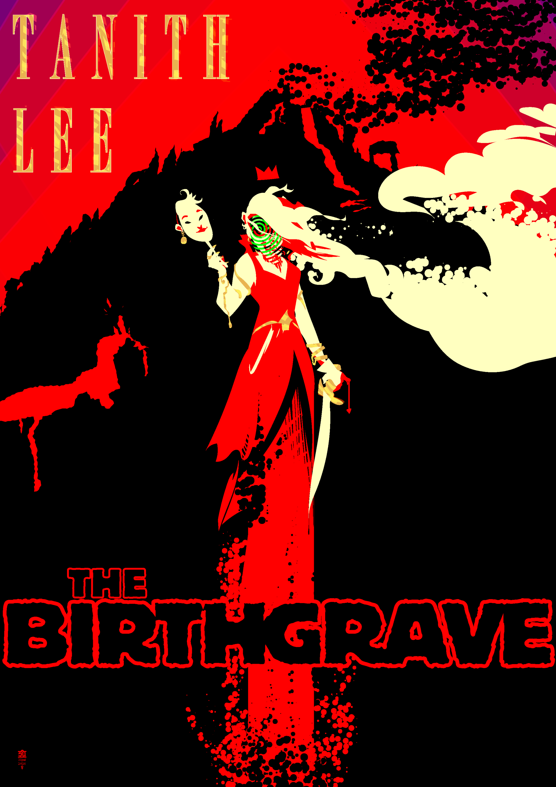
A couple days ago I started reading Tanith Lee’s first published book, “The Birthgrave”. It is a pretty wild ride. A nameless narrator wakes up under a volcano that erupts shortly after she leaves; she wanders through a medieval world, trailing chaos and destruction in her wake, with dream-like detachment from all the strangeness and horror around her. A few chapters in this image presented itself in my mind and would not go away until I got up and drew it; as I read the book I kept on occasionally returning to this and refining it.
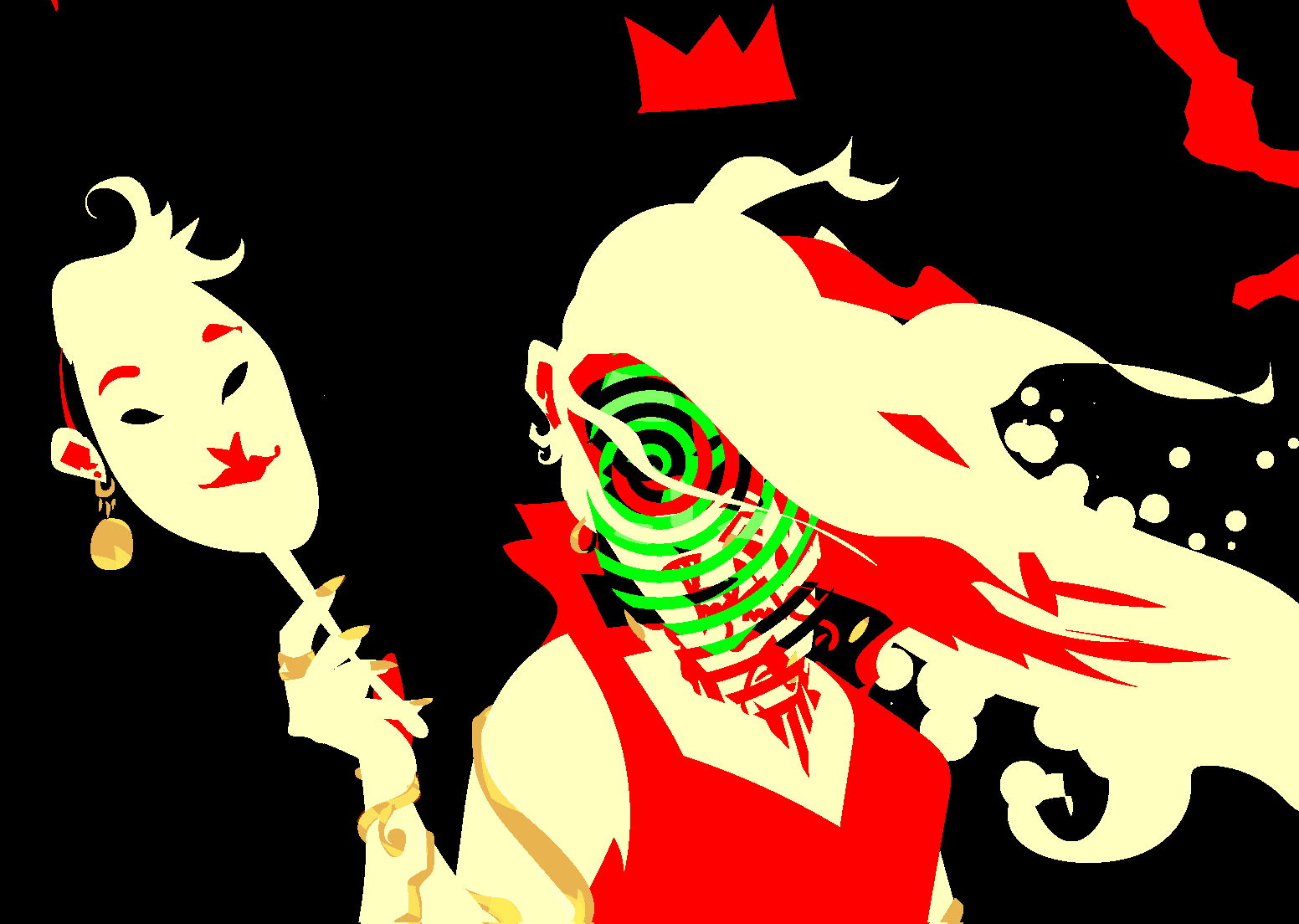
There’s a lot of ambiguity about the protagonist’s face through the whole book. She describes herself as hideously ugly but never goes into detail. She’s constantly wearing masks to hide her face, hence the one in her hand here.
I went through a lot of iterations on the type, and all of these iterations got preserved in hidden layers in the file, so here they are. I generally went with really big and bold type because most book covers are rarely seen larger than a little thumbnail image in an e-book app’s library any more.
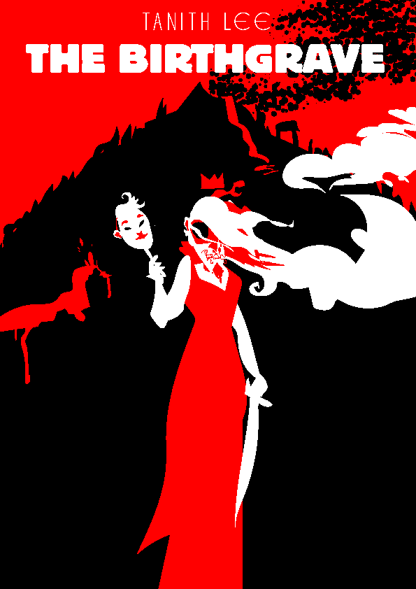
This was pretty much my initial sketch.
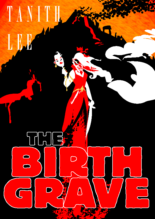
This is where the figure and bg were for a lot of the time I worked on this, the sky went from flat red to red/orange/yellow, then finally to red/purple near the end. The green spiral face stuff was one of the last touches too; both of these final choices are informed by events near the end of the book.
I really liked how big and bold this type was but hated how it lost the way the title is clearly two words crammed together into one. BIRTHGRAVE hits harder than BIRTH-GRAVE or BIRTH GRAVE, it just feels a lot more WTF-inducing.

I tried a few different fonts and this one was kind of working but it drew way too much attention to itself and felt too much like a comic book. Also I did not like the way its counters were filled in, and did not like the way it looked enough to chop and screw a more normal font into something similar.
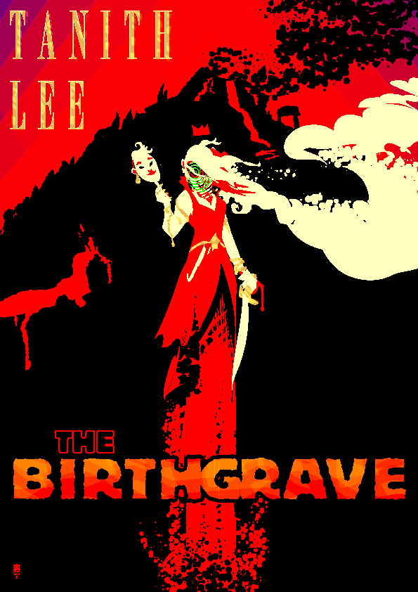
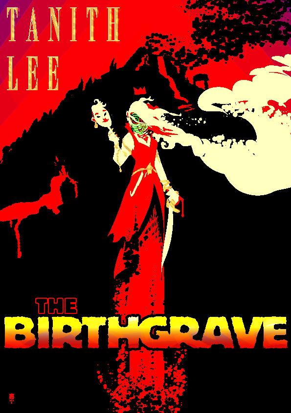
I kept on trying to see if there was a way I could make colorful type work but it drew too much attention away from the figure; ultimately I decided less is more.
Here’s the final version again, shittily scaled down by WordPress. Works pretty good. The face changes depending on the scaling and I very much like that.
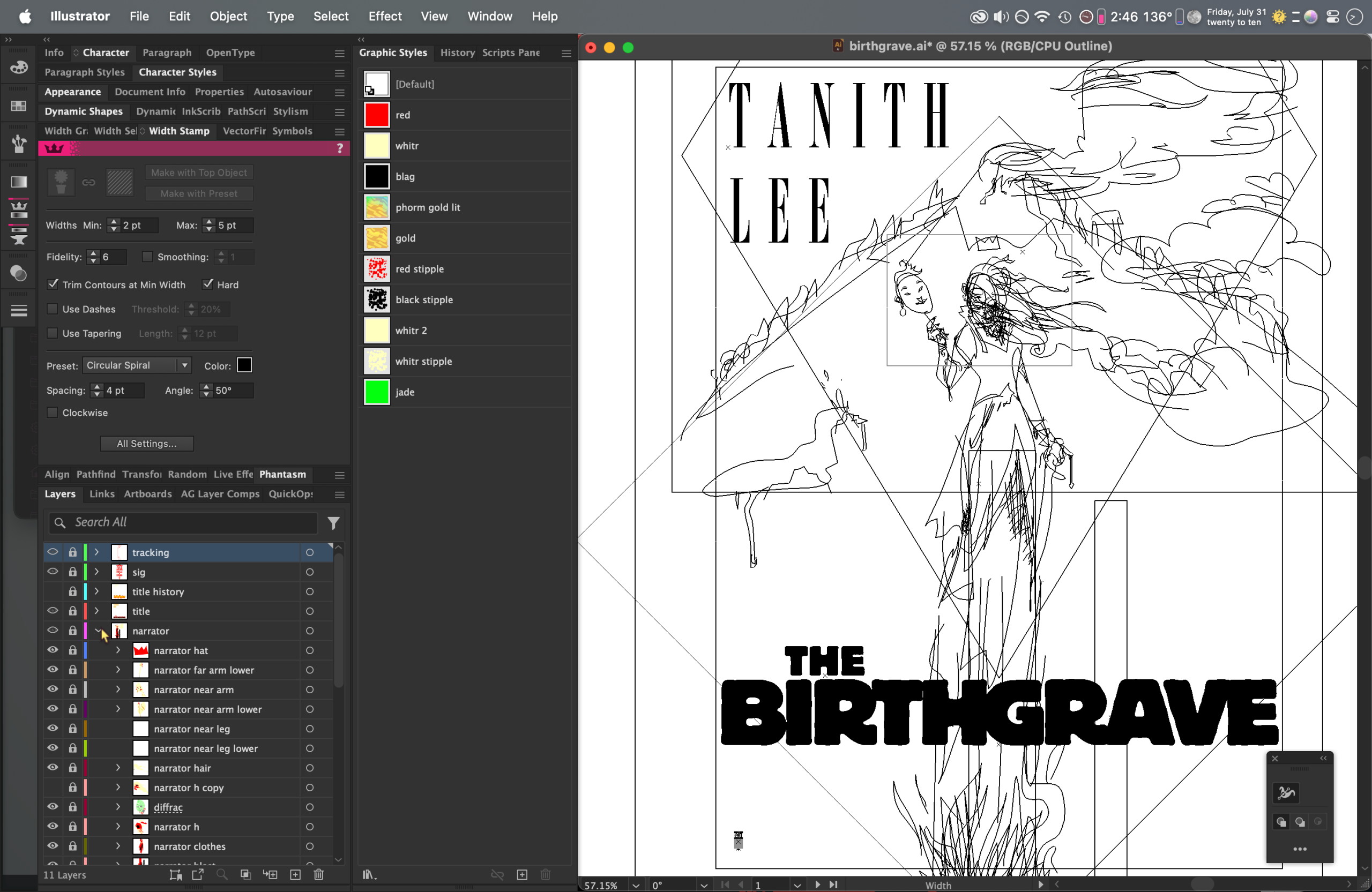
Outline view. 100% human-drawn shapes in Illustrator, no AI involved.