furniture reorganization

Today, I got absolutely no art done. Instead I spent much of the day doing some bookshelf organization – I put a lot of stuff on the shelves that had queued up on the floor next to them, and on the coffee table in the studio. I had a good excuse to do this: Ian and Nero were going to come take my couch. They'd just moved into town, in a house with three other cartoonists, and no furniture. Now they have a couch. Which left my apartment amazingly quickly; a couch moves a lot faster when you have five dudes hauling it instead of one lady and her boyfriend!

Said couch has a history. I got it from Erin, who gave it to me when she moved in with her boyfriend, who had a better couch. She got it from another artist. It is chock full of artist farts, and will become even more so soon.

Meanwhile, my living room is much more spacious; the giant beanbag chair I've been using instead of the sofa is no longer crammed into the space between the couch and the wall with the TV screen. Instead it's got a nice healthy amount of space on all sides. I'm going to find a small table to put the 360 on and hide all the cables involved in that and the subwoofer, and then I'll be pretty happy with my living room!

Miss Fussyspider is, of course, MUCH happier with the state of the living room. It still needs work – it always will – but it's much tidier, and has closer to the Right Amount Of Stuff in it.

Of course, even as I say that, I had more stuff show up today…
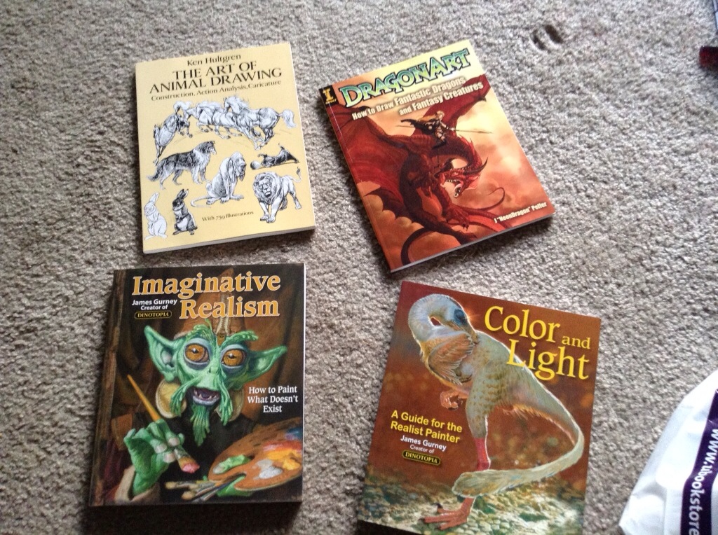
The top two books are definitely going to Lucy this Christmas, along with some art supplies. The bottom two… well, maybe they'll stick around here, they may be a little advanced for her right now. Also I kinda want to pick up some stuff from them myself.

I may do some art today even with all of this furniture moving. Tonight's SICAGA, I figure I'll take my sketchbook and the ipad and work on the roughs for the “demon booty call” story I've been kicking around with Nick. I've already got one page sketched out, I'd like to have a few more soon.

I also announced the third stretch goal for the Rita 2 Kickstarter: if about 350 people buy a book, I'll drop the price, because I'll be able to order enough to get a lower price from the printer without having a closet full of the things for the next six years.


self-repair: online

Recently, I went running for the first time in something like a month. It took me a week to recover; my legs were killing me for days. Yesterday, I went running again. Today? I almost feel ready to run again.

I bitch about the human body, but it’s self-repair is pretty good sometimes. I just wish I could get in shape, then tell the self-repair and self-optimization routines to keep me like this instead of constantly having to convince my body it needs to be ready to spring into action at any minute by regularly pushing its limits.

It’s still on notice. As soon as I can replace it without a drop in the quality of my life, I’m off this coral reef wrapped in meat and onto something more easily repaired, upgraded, and backed up.

on presenting web comics

More and more, I am feeling like the right way to present a graphic novel on the web is to have page 1 or chapter 1 (depending on which is the fundamental Reading Unit of your comic) show up on the front page. Have easy, obvious links to the next reading unit. And have a link somewhere to the latest page, for the people who want to keep up manually.

Smack people in the face with your story’s initial hook, the instant the page loads. Don’t put anything in the way. Don’t dump the 300 pages in and expect them to get hooked.

It’s okay to have the first/latest page(s) be one click away – IF they’ve got big, bright, attractive links that are clearly one of the most important things on the page. Opplopolis (by the same guy behind ‘Nine Planets Without Intelligent Life’, if you remember that) is a good example of that mode.

(If you’re a young artist who’s improved a lot over the course of the comic, this may be a bad idea. I’m mostly considering long-form web comics done by artists who Know Their Stuff.)

starting past level 1

I'm playing this little Megaman-like game called “ARES: Extinction Agenda”. You get to control two different robots on a linear quest through a space station populated by an evil machine-possessing gas.

As you play, of course, you acquire new powers. You also level up. And the thing that just struck me is this: One robot is portrayed as young and inexperienced, while the other is old and cynical. And yet both of them start at Level 1.

Why isn't the old warrior, like, level 30 or something?

That might be a pretty cool way to structure a game like this. Play through as the youngster, then once you do that, you unlock the old warrior's campaign. Which is generally MUCH more high-powered, right from the start.

the process: a cute AI globby brush

Here’s a fun little brush I just whipped up in Illustrator.

1. Draw a 1-pt line.
Screen Shot 2013 10 11 at 4 32 50PM
2. Go to the appearance palette, click on the ‘fx’ dropdown. Path->outline stroke.
Screen Shot 2013 10 11 at 4 33 04PM
3. fx->distort & transform-> roughen.
Screen Shot 2013 10 11 at 4 33 29PM
These are the settings I used, go with whatever makes you happy.
4. Drag the ‘outline stroke’ entry in the appearance palette ONTO the ‘stroke’ entry.
Screen Shot 2013 10 11 at 4 34 06PM
5. Drag the ‘roughen’ entry to just above the ‘outline stroke’ entry.Screen Shot 2013 10 11 at 4 34 14PM
6. Drag ‘outline stroke’ ABOVE ‘roughen’.
Screen Shot 2013 10 11 at 4 34 21PM
I tried other ways to make this stack of effects happen, but this is the only one that would reliably and repeatedly work for me – I’m pretty sure this is some kind of bug.
7. Now you have a cool brush with messy edges! This is a 6-point dark purple stroke, with two 1-point strokes slashed in over it in a lighter color.
Screen Shot 2013 10 11 at 4 34 45PM
Screen Shot 2013 10 11 at 4 44 25PM

I may never draw a squiggly highlight by hand again. I’m making a graphic style of this and sticking it in all my startup documents.

BONUS ROUND: PRESSURE SENSITIVITY!
Screen Shot 2013 10 11 at 4 45 24PM
Make a simple calligraphic brush. Now you can use the brush tool (B), vary the width of your squiggly lines with pen pressure, and choose different “sizes” of brushes with the stroke width panel.

You could probably do a bunch of other interesting things with this method of outlining a pressure-sensitive stroke, then applying live effects to it.
Screen Shot 2013 10 11 at 4 52 07PM
Stylize->Scribble looks pretty cool, for instance.
Or how about stylize->distort and transform->pucker and bloat?
Screen Shot 2013 10 11 at 4 56 14PM

Fool around, stack some effects up, experiment. If you were really dedicated you might be able to produce a really fun set of janked-up styles.

Kickstarter 100%

So the Kickstarter for Rita 2 funded tonight while I was kicking back and playing Saint's Row 4. I feel pretty good about this; it took me a little less than half the campaign to make what it took me a whole month to sllloooowwly crawl up to last time. I've got a few stretch goals but I'm really just gonna let it be for a few days, and spend time working on the last couple pages of the comic and some short story side things. (Backup for P, SP collab(s), HM/DA proposal, maybe some lingering commissions even, those would be nice to get out of the way for once and for all)

I'd sent out a few more publicity requests; those will probably show up in the next week if at all, and we'll see how much of a boost they give me. KickTraq is currently projecting a final range between 10k-17k, really anywhere in there would be pretty amazing but enough to print it is all I wanted. More will be lagniappe.

I'm glad to be able to stop worrying about it, really. I don't like who I kinda have to turn into during a Kickstarter campaign. Now I can go back to being this relatively quiet lady who draws comics.

another day

Man, it’s good to be able to do some of my usual routines again. I went to the farmer’s market for the first time in three weeks; I was out at conventions the last two weekends and missed it. So now I have REALLY SPICY CHEESE and AWESOME HEIRLOOM TOMATOES for salads.

I puttered around the house for a while doing things like folding my socks – this takes a while when every pair is different, and when part of me insists they have to be sorted by color – and neurotically refreshing the page for the Rita 2 Kickstarter. Eventually I said “fuck this”, grabbed the iPad and a sketchbook, and went out to work on the layouts for a 5-page short I’ve promised to do in the next couple of months. I got four pages done; I’ll need to do some reorganizing of the third and shuffle some stuff from 4 onto 3 before I can really finish it. It’s a first draft, and it mostly works, so I’m happy.

I also grabbed a new mechanical pencil on my way out to work on that. The sketchbook I had on me was too small for really working out pages with a slowly-blunting 2B. I used to use .5mm mechanical pencils ALL THE TIME when I was in high school and college, then abandoned them when I discovered the joys of roughing stuff in with the side of a wooden pencil. I’d had a nice mechanical .5 one in the past few years, but I gave it away to a friend who was positively drooling over it, then the place I’d gotten it from never had it again. So I looked at the stuff in the closed display case at the UW bookstore’s art department, and ended up getting a .7mm Pentel Graphgear, with this really cool retractible tip – most drafting-oriented mechanical pencils have a little metal sleeve sticking out a quarter of an inch or so, to protect the lead when you’re drawing against a ruler/template/etc, and also tends to snag in a pocket; this one has that but can pull it back in. I loaded it up with 2B lead and I’m really liking the experience a lot; the slightly thicker lead feels a lot less snap-prone than .5mm was. I used to scoff at the idea of anything thicker than .5mm; I guess things change as we age, huh? I tried a .9mm as well, but found it to be too thick for what I was looking for. Also the .9 was yellow and silver, while the .7 was blue and silver. Yes I am a shallow thing who likes surface appearances.

The Kickstarter is taking longer than I’d initially hoped – I’d thought I might end up celebrating 100% funding last weekend – but I’m not complaining. $6000 in two weeks (I figure it’ll hit 100% tomorrow or Sunday) is still a little more than twice as fast as it took book 1 to crrraaaawllllll to a little short of its $6000 stretch goal. I dunno if I’ll hit any of the stretch goals I’ve got planned, but I’m not really much bothered if I do – spot gloss on the cover would be nice, but is by no means as crucial as spot gloss on the interiors is. Having the “two books” tier REALLY HELPED; right now that’s both the most popular reward, and the biggest chunk of the money. In fact, given that it’s accounting for almost $2200 right now, it will probably always be the biggest chunk of money – even if all the sponsor-level slots are taken, those are still limited to a total of $2500 because they involve me actually drawing unique stuff. I said when I started that I wanted this campaign to work primarily by just selling some books to more people than I did with the first volume, and it’s doing just that. (In fact, I just did some counting – as of now, 107 people have pledged at a tier that gets them a copy of Rita 2 and possibly more, versus 102 people who got a copy of Rita 1.) I’m pretty happy with that result. It’s not INSTANT INTERNET BEST-SELLER EXPLOSION!!! but it’s looking pretty damn good, and I figure Rita 3 will go even better.

good job Congress

Dear Republicans, can you please just fragment your party already? Split off all of these obstructionist fundamentalists who will accept no compromise into their own Whiny Two Year Old Babies Who Only Know The Word “NO” party and start a new one based on the things you actually think are good for the country.

Thank you very much, from a liberal poly transwoman who is just really fucking sick of this shit.